One of the questions our team is asked all the time is: Why do the colours in my design look slightly different on the finished printed product? The answer is simple, it's all about the way the colour is created.
The technical bit
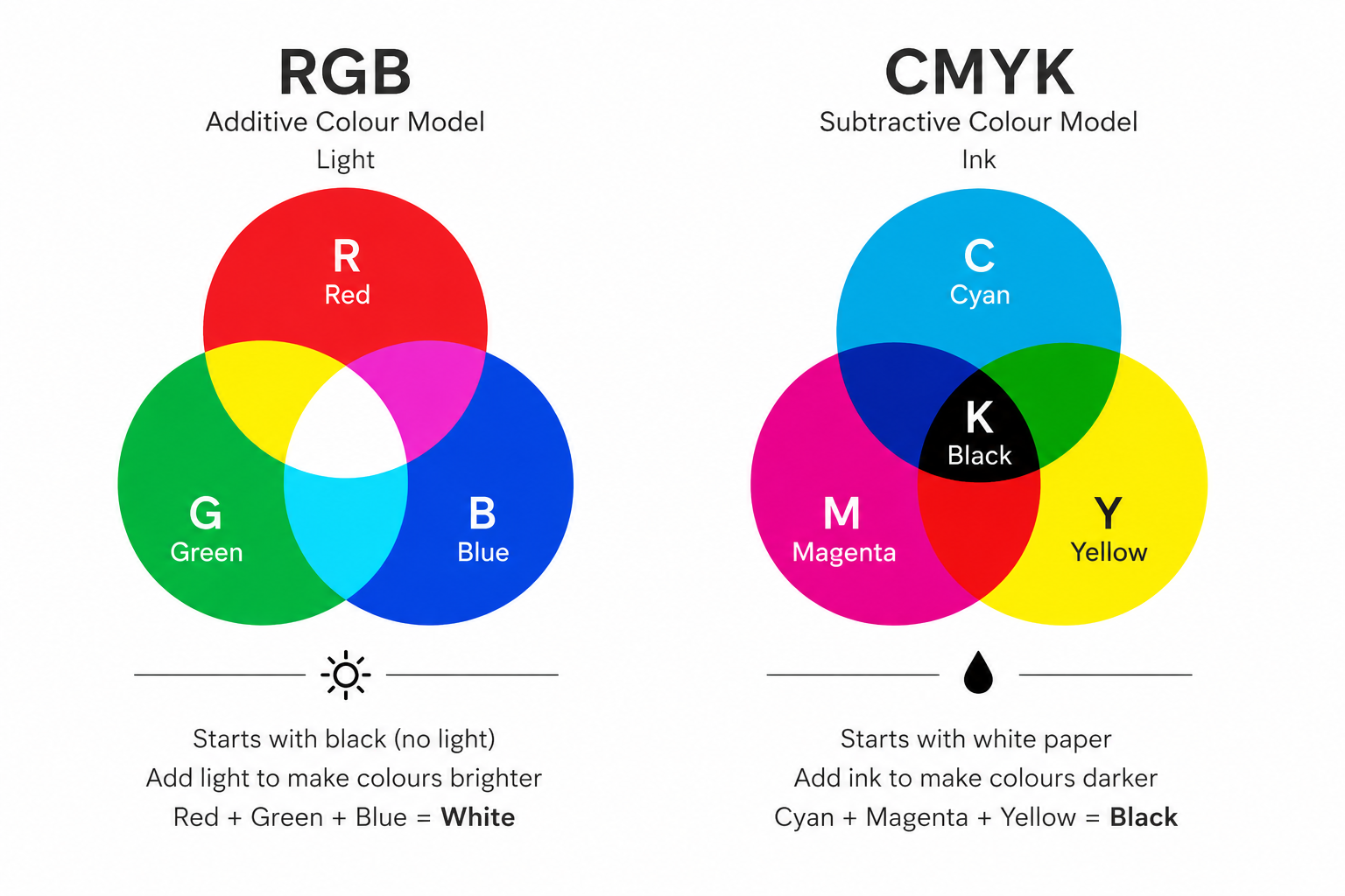
RGB stands for red, green and blue and is the standard for all digital products. You'll be reading this blog on a phone, laptop, iPad or similar device, all of which use RGB to create the different colours you see. This technique starts with black (no light) and, as you add red, green and blue light, the colours become brighter.
CMYK stands for cyan, magenta, yellow and black (key). The K for black doesn't seem to make much sense until you understand the history behind printing techniques and where CMYK originated. K actually refers to the key plate, an old printing term for the plate carrying the main detail, contrast and black text of an image. This technique starts with white paper and, as you add CMYK inks, the colours become darker.
Why do the colours look slightly different from the screen to print?
Very bright colours, such as vivid blues or neon greens, can look different on a printed product compared to what you see on screen. This is because a printer cannot reproduce the full range of RGB colours using standard CMYK printing techniques.
How can I make sure my printed colours are as accurate as possible?
While printed colours may never match a screen exactly, designing in CMYK, avoiding overly bright RGB colours and checking a proof before printing can help achieve the closest possible match.
If colour accuracy is particularly important, it's always worth discussing your requirements with your printer before production begins. At Carly Press, we can also provide a full printed proof of your project for approval before the main print run goes ahead, giving you the opportunity to check colours, content and overall appearance for complete peace of mind. This service is available for a small additional charge.